Monday 10 December 2012

History of a music video

Throughout time music has changed, whether its the genre of Rock & Roll or Pop all genres have made a dramatic transformation, which has defined the music industry and made the whole world of music change and become more dynamic and diverse.

From legends like Rod Stewert and Queen who dominated the charts for the Rock industry to Bob Marley who opened up the music industry for black and oriented people as before him, people uneducated and ignorant to other cultures did not believe that Reggae music should be pursuaded.Not only has music entertained people but a whole worldwind of emotions and indepth stories which may not have been known if it wasnt for music.

'Top of the Pops' which was aired on the BBC was one of the most dominant music shows featured of the 21st century, which involved the most popular singers/bands of the week to perform to build up the stars fanbase and acheive more publicity with their music. Also it was vital to be shown on such shows as Totp because music videos were only shown on a couple of tv shows, and video footage for music videos would usually be live footage of the performers as diverse videos were not yet to be achieved in the technical world but this also benifited the artist as their demographic would witness their idols performing without autotune or miming.

More recently in the past 30 years artists have adapted to the use of becoming a marketing puppet, which involves the stars being moulded to fit the music criteria of what the music companies think are 'perfect' for the industry, so they will make artists (especially new artists) conform to singing songs that the artist doesn't necessarily like but record labels agree will sell. But music used to be what an artist wrote and the fanbase would know the star more personally as they have wrote the songs.

The use of music videos has really encouraged the artist to engage with their demographic; such artists as Lady Gaga will provide videos to shock and entertain her audiences as this links her with her audience as she requires their needs of being an individual and providing footage fit for her wacky lyrics.


1970's
The late 1970's was completely different to today where artists can easily create and air music videos, the majority of music artists would appear on the show Top Of The Pops which was considered an opportunity in the music industry that helped artists become more established and known in the industry. By performing on the television show, obviously it was broadcasted meaning through this appearance they was automatically more recognized for their music/talent. This show broadcasted all current songs too, this made it vital for artists to appear on the show in order to be considered current and popular and reach out the a potential target audience, they would also obviously appear alongside already popular artists meaning they became familiar with the industry too. Before this the only type of music video that was created was performance based, this had both disadvantages and advantages, the disadvantages meant it was difficult to stand out against other artists as all music videos were similar, it also made it harder to distinguish the genre of music their music video fell into. However with a performance based music video it showed the artist live meaning the audience could easily see their talent. 

Queen - Bohemian Rhapsody was the first music video to step away from the performance based music video that all audiences were familiar with, the music video being different is a big factor in why the music video and song went on to be so successful. Despite it being so successful, due to the technology still limiting the music video the video still looks of a lower quality as opposed to music videos produced today, this is evident as this music vide was created with a videotape whereas today we have various pieces of equipment to create one music video. While some artists continued to create performance based music videos, many decided to experiment with concept and narrative based music videos which contributed to their success as it interested the audiences as it was new and different from the music videos they were used to. This made it easier for a artist to become successful and profitable from the music video, giving artists a advantage when creating different music videos this was because they could create something thats interesting meaning more people will view it, as they're considered more interesting than a performance based music video.

1980's-1991.
Slowly as more music videos were created where a music video could differ from usual conventions, they became just as popular as the song and artists themselves. The music videos developing with the software gradually also made it easier for the artist to create a certain image for themselves, e.g. a innocent image could be portrayed through a simple music video with the artist and a love narrative whereas a more edgy image could be created if the female artist was dressed and dancing provocatively. MTV is a network created in the US, its massively successful and recognized globally, although it was created in 1981 MTV has developed and changed according to the times meaning it air's the most current music, it began airing Madonna who contributed also to how big music videos were to become, it helped the artist not only establish a certain image it gave them a personality at the same time that the audience could take in. It also provided the opportunity for the fan base and target audiences to become more involved with the artist they found interesting, as the you become more familiar with who the artist was from how the artist was represented. Music videos soon became necessary to create publicity for the artist, taking all this into consideration the music videos still are no where near as advanced as they are today with all the software and technology that has been developed to edit the music videos making them of a higher quality. 


Wednesday 5 December 2012

Group Magazine

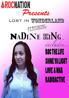
For our group magazine, we tried to interpret the theme of R&B but also a hint of Pop throughout advertising for a promotional tour advert. Both me and Nadine took time looking at our Rita Ora (our artists) posters and also artists that are familar to her and of the same convention; we took inspiration with other posters/advertisements layout, designs and contrasts of colours.

I feel that this poster connects with a demographic of both R&B conventions and Pop as the bold and intimidating font and dark/edgy colours red and black appeal to a stereotypical R&B fanbase, which contrasts to the bubblegum pink background which suggests the artist has a fun and bubbly side to her which helps to intrique both audiences of a R&B and Pop demographic.

The 'Roc Nation' logo helps to lure in any fans of the record labels fanbase as the label is very popular label which manages stars like Jay Z, Kayne West and Rihanna ext. Which sets out huge expectations for this up and coming artist.

I feel this advert is good as it is clear who theartist is and what the advert is telling us to do, and is crucial to appeal to both male and female audiences with the use of pink and black. The font also can showa metaphor for the artist by suggesting that because the fonts are different sizes that she doesnt take herself to seriously and has different sides to her.                                                     

The 2nd promotional advert has a more edgy vibe to it, which features reds and blacks which suggests the artist is mysterious and has a bold and intimidating persona, which fans might be interested to find out more about but also a much more controversal font that some audiences may find hard to view. We felt the glow on the artist and 'Wonderland' suggests a more ghostly and interesting effect which makes it stand out against the bold red background. However the use of Italic and swirly writing helps to engage a more feminine and girly audience but also portrays the artists fun side.

The actual advertising of this poster is more specific and helps the audience with what the album looks like and relates the poster back to the album of the digipak which is more simplistic for the demographic.

We felt that this poster was overall more effective as the colours seem to have a consistancy of a colour scheme and the overall look of the poster is proffesional. Also the conventions of the advert can easily be compared to our chosen artist Rita Ora as she like to use dark and powerful colours and have a close up of her face and all the information that is needed is on the advert.

One way I think this poster could be improved would be to have a popular radio station or magazine to rate us or comment about the album, which will also be good for the media for our artist and audiences will be even more intriqued to find out about her.


We decided the most effective of the 3 magazines was thelast advert to the right, because it not only advertises the artist but also the product which is shown in the bottom left hand side of the composition and by developing our own research into magazine we acknowledged the fact that audiences do not want to be overwhelmed by loads of writing but a basic and straight to the point layout of an R&B convention, which we have tried to follow in this advert, which we felt as a group was eye catching, followed the theme of red,black and white which creates a rough vibe to the artist which helps connect the artist and demographic.

We felt that the poster that Nadine created for the group was successful and really helped capture the look of the R&B vibe we was going for as the text used was hard hitting and we felt looked professional as we see the artist and the product which in the real world really helped promote the artist.


Filming Schedule

It is easier to keep to the storyline of the video, and helps us to stay on track with a schedule as we will have a clearer understand of what we need to do, how long it will take and what will be happening in our scenes. This helps us to not waste time by filming random shots that we may not use and also how to be successful with the use of fast pace editing as filming a forest for long periods of time will not be entertaining for the viewer. 

This will also help with our acting as we know what character we will be portraying and have a deeper understanding to what we are trying to portray in our video, instead of getting withdrawn from the project and losing crucial ideas that will make the video professional and th best of its ability.

Did you follow the schedule while filming or did you make changes to the initial plans?

We initially wanted to follow the schedule as closely as possible because we did not want to confuse the audience and wanted the story of our narrative based video to be clear. However we did come across a few altorations which effected our filming; we had quite a few trouble filming due to weather issues as the severe rain would have damaged our props and also due to us filming in the Winter season it became dark very quickly which really put a holt on our initial plans but this also benifited us as we thought of better ideas and a solution of filming.What would have been the forest scenes instead we thought would be more beniffical filming indoors,which mkes the video appear unique as not many artists use home footage in their videos and will relate to the theme of a conventional R&B video as we have tried to porceive a cool and laid back vibe to the video which will hopefully make the audience feel comfortable with the artist. So even though we did struggle with some major parts of our filming process we have over come what could have been major problems and used this to the best of our advantage, which hopefully after he editing process has finished will show a sucessful and professionl music video.

Risk assessment

It is crucial to keep in mind risk assessments as our group will be filming in areas like London which can be extremely dangerous if risk assessments are not involved ie. props,actors and equipment. Also we must take into acount other members of the public as we could put them in harm. With our sparklers for example we will have to make sure we have a bucket of water near by just encase the sparks get out of control, also it would be necessary to wear gloves encase the actors burn their hands. 

1. Work out what areas in location could be a hazard.
2. If the actors are in any danger and what could harm them 
3. Be precausious and decide and evaluation the risks
4. Record findings and discuss of how we can prevent props/actors from danger.
5. Update and review 

THE RISK:
Is the chance high or low, that somebody could be harmed by the hazards, together with an indication of how serious the harm could be. Which would be crucial to insist when using any of our props but especially crucial when they could seriously hurt someone and that could get us in trouble.


Tuesday 4 December 2012

Planning location

Forest
We will be opening our video in a forest which will firstly show our video to have a original setting and will define our video more clearly to have an alice in wonderland take into the world of hopes of dreams for our young artist. We want our video to be fun and a bit quirky to really connect our artist/genre and video all into one. The girl playing the persona of alice in the video will start under a tree reading a book, which will admediatly start the music which introduces another character to the scene who will play the rabbit persona of Alice in Wonderland who leads her on an adventure to the wonderland that is London. The forest scenes will show a variety of establishing shots, long shots and panning shots to make the scene appear confusing like we are in the alice esque actors brain and taking this journey with her. We will have to keep in mind that for safety measures if the grass is muddy we will not be able to run as actors may hurt themselves and also the surface of the tripod is steady as the shots will appear wonky and uneven which wont make our filming professional. Also any unsteady surfaces could cause injuries so we will have to take this into consideration but on a possitive side we will not have the bother of other members of the public, so the scene will not be as complicated to film.

Brick lane:
To create an urban vibe to our vibe; we have located one of scenes in brick lane,which is well known for indie/individual people to hang out as it has a laid back back and arty feel to it with its various graffiti walls which we thought would be ideal t the video. In various parts of the video we will show short jump cuts throughout of the artist singing against the wall which endulges the audience with the the area and that the artist is trying to appear as cool and we think think that the walls will look proffesional. Our artist Rita Ora tries to keep her music videos original and orientated so thats what we have tried to put across in the video as graffiti walls are not so glamourous but the artist in the vieo somehow feels at home with them and released from the crazy 'Fantasy world' which we will be locating in central London. Various close ups and midshots of the album will be shown here as the audience can connect with our artist and help to distinctly reconise her.

London:
London is the must place to be, so it was only necessary that we showed central london as our 'Fantasy World' as this is the place that could make your dreams come true, but it could also crush them; which is the overall moral to our music video. By editing the lights from the city and cars on final cut editing,we feel that we can really exagerate and empasize the look and make them appear more disirable for an overall more detailed visual metaphor. By creating a story with our video we will show off how london appears to seem so magical and endearing but as the video goes o our Alice in Wonderland esque actor of the video gets lost in the more brutal side of london and doesnt like the downwards spiral she has got herself caught up in; This is a metaphor as some things in life may look nice but could have a whole other meaning if you look into to it.

Their are risks while filming in london that might set our filming back as we will be relying off weather and if it rains we will have to be careful of our filming equipment encase it gets damaged. But the weather could either way work in our favour as when attempting to show the glamourous side of london, if it was a bright day this would show hope and success, butalso if the weather is cloudy and grey this could connotate sadness and the downwards spiral of losing control in this wonderland.  Another effect we may come across while filming would be how packed london will be at cerain times of the day, so it would be necessary to look into what days and times would be best to film and also certain areas in london may need permision to flm.

Monday 3 December 2012

Photoshoot

It was essential to carry out a photoshoot as it is necessary for fans to connect with the artist and shows the artists image as the audience can interpret the look of an artist with their own and a look of an artist/group can sometimes effect if the demographic can relate and like them; acts like One Direction may not technically have the best voices but young teenage girls will more likely be tempted to buy an album because they are attractive. For our photoshoot we decided that we wanted our pictures to be conventional of our artists genre as they are a crossover artist of R&B/Pop and decided it's important to draw in fans of both sides of the music. It is crucual that the audience begin to reconise their artist and will help grow a bond between a fanbase and an artist/band. 

The 2 images to the right we decided, it was best not to use them as our the cover of our cd; we feel that this image was a great image as the colours in the face seem to pop out to the viwer and also the artist shows a happiness behind her eyes which makes the audience feel comfortable with the star. However we come to the conclusion that the overall image would suit a well known star better as only half of the face can be seen, which suggess we should know the artist already, which would not be ideal for up and coming artists.


The angle of the shot is ideal as it appears that the artist is inferior to the audience and feels as though she is waiting for the audience to judge her. But this would genrally be better suited if the star was just a Pop star and does not perceive a R&B vibe with her look as she does not appear intimedating to the audience which stars like Rihanna or Nicki Minaj thrive for when creating their covers. Also the colour of the overall image looks of a sepia colour which is unprofessional so would need to pay more attention to lighting in the furture. So this is why we decided to not use this as our artists first album cover.


This final image was one of the many images taken from the photoshoot, but we felt had the most professional feel to it and really appeals to a R&B/Pop demographic. The artist looks like a star and she is connecting with the audience through her eyes as the close up feels intimate with the artist and the audience. Through the use of photoshop I feel that the image could have huge potential but would have created more effect and would be easier to edit in photoshop with a green screen background, but still this image creates an intensity that Beyonce and Rihanna use to entice fans to buy their music.
Our groups photoshoot consisted of wide shots and long shots but I think to make the images appear more proffesional we could have maybe took more time editing photos to give a touch up and more images including extreme close ups as the star is still not very well known so the demographic must have a clear idea of what the artist looks like.However a long shot of an artist gets across the whole personality of the star and what they wear and you can have more of an insight into how they would act which is also benifical with new musicians; which we will know in the future when creating a photoshoot for a new artist.


Monday 26 November 2012

Censorship

Censorship
Censorship is monotoring the content in books, magazines, on the internet and in things produced by the entertainment industry such as music videos and films. For instance a lot of films have certificates of 18 along with video games like Vice City and Resident Evil. The same sort of thing also applies to the music industry and the videos and lyrics of artists. Censorship can affect almost every artist in most genres - for example the music videos of Rock artists are sometimes too violent to be shown on a television network such as Scuzz before the watershed because it could run this risk of younger children seeing it and getting frightened. Another example of the music industry being censored is on radio and its lyrics, if a song has lyrics considered to explicit for radio listeners at a certain type of day lyrics will either be blanked or won't be played. Examples of songs that have had this procedure are:
- Clique by Jay-Z, Big Sean and Kanye West For excplicit language
- S&M by Rihanna For sexual references and suggestive visuals in her music video
- Run the World (Girls) by Beyonce For insinuating the beginning of a swear word, "who run this mother-"
- Niggas in Paris by Jay-Z and Kanye West For excplicit and innappropriate language
- R.I.P by Rita Ora and Tinie Tempah For explicit language and innappropriate language
- Peacock by Katy Perry For sexual metaphors throughout

The reason that songs are censored is to protect any younger or inappropriate audiences that it may not be socially acceptable for them to hear lyrics such as swearing and younger people or racist words that others may find offensive like "Nigga" which is featured in a lot of R&B/Rap songs.

During a lesson we looked closely at Eminem and his music, debating on whether he should be censored or not. We had students stand in as Eminem himself (the artist), his record label, his super-fans and a dedicated fan that'd grown up listening to his music for a lifetime who were all against him being censored. On the other side we had students standing in as parents, fans who didn't agree with the swearing and radio companies who were for him being censored. Some of the arguments we heard for Eminem not being censored were the following:

- He raps about things that are real to him: If artists are rapping about things that are 'real' to them and teaching their fans and listeners to stay true to themselves then surely that's a good thing as oppose to rapping about superficial things like fame, money and sex. It also helps fans and young people understand that it's okay to go through struggles.

- Young children shouldn't be listening to Eminem anyway: There are a variety of radio stations avaliable and if people are listening while around little children they have the option of turning over. There's no need to censor Eminem because he's clear that he isn't around to parent and has a very specific audience therefore there isn't any excuse to be listening to him.

- If you censor Rap and Eminem then people will digest explicit natures from other genres of music: Artists such as Katy Perry and Britney Spears who are a completely different genre from Eminem still have been censored which means that there's explicit content in other genres which could also have a negative influence on their audience such as revealing costumes, sexual references and contriversial concepts and narratives in videos. 

In contrast, we also had arguements against Eminem which were:

- Violence isn't acceptable from any artist, ever - One of the big arguments was that violence isn't accepted in society so why should we accept it from one of the most influential people in Rap who a lot of young adults and teenagers look up to? A song that definitely sparked up a lot of controversy was "Kim" by Eminem since he rapped about actually hurting and murdering his ex-wife. People try to teach the younger generation that this behaviour isn't acceptable and Eminems violent lyrics aren't making it any easier.

- Not only does Eminem swear but he insults other artists - In Eminems lyrics he insults many other artists such as Michael Jackson, Jessica Simpson, Lindsay Lohan, Hillary Duff and Sarah Palin. A lot of people said that they had a problem with him being so rude and insulting towards other artists and public figures because they're also fans of them and it was uncalled for. It also contributesd to Eminem's negative image that he is associated with a lot until this day.

In my opinion I think that Eminem and other artists should be centered to a degree because there are certain things that could be seen as offensive or inappropriate the music industry does often go viral and it's very hard to stay away from certain things. Also, I agree that music videos with explicit content should be banned but not so they're removed from television completely. It'd work better if there was some sort of watershed in place to filter these videos until a later period where young children and pre-teens might not be watching TV or able to see them, like a lot of television shows such as Big Brother, Skins and Geordie Shore. As for the internet, that shouldn't censor music or music videos as there are filters users can set so that content considered for over 18's is removed.

Looking at censorship has made me consider the content we put in our music video because we want to appeal to our young adult audience but don't want to have too many offensive features that may turn viewers away from watching or be unattractive.


Digipak


                                          COVER DRAFT:  


By creating a floral background, I felt it created an innocence and purity to the artist. However the colours are very girly and do not fit the conventions of a typical R&B cover, but would be better suited for a Pop artist. The image of the star creates a chilled vibe,which would be seen from an artist of this this genre. I would make the cover darker with reds and blacks which sets the mood of the album. 


I feel that this front cover of the digipak really connects with the demographic as a teenage audience would be appealed with bold and graffiti-esque font which also makes the cover conventional. The artist looks smaller compared to the writing this could be seen as a metaphor for her music and how she feels isolated, which suggests what music the album will consist of. By making more detail on the left side of the composition I feel the cover will come to life, instead of looking bland and will jump out to our targeted audience.


                                    TRACKLIST DRAFT:


I feel that the tracklist looks conventional to lookin like a R&B digipak and looks effective as the first thing that catches the viewers eye is the shouting lips which could suggest the music on the album will be loud and opinionated  but also looks like they are shouting the tracklists to the audence, what I felt looked really engaging. Not only do the colours green and purple clash but the overall feel of the look of the tracklist is disfuntional which makes the demographic uncomfortable, which most R&B artists try to portray as their image is usually a hard and steady alto-ego.


This I feel was one of the most successful of the digipak slides as the leaves creates a demonic atmosphere, but the leaves merge into a heart so this could be represented that with happiness their is darkness which really sets the mood. The font is elegant with a twist and the 'Wonderland' has a circus vibe to it; this could show a fun side to the album. I would next time attempt to add more colours to divide the black and white.


INSIDE DIGIPAK


The brick background interprets a street vibe, and makes the artist feel close to the viewer as the environment is naturalistic. Also the relaxed expression on the artists face, shows a friendly vibe which connects the demographic with their idol. Also the flowing hair shows glamour which female fans will admire and take into account for inspiration. In future maybe a more aggressive pose would be necessary for the R&B conventional look.


The background writing seems to be hidden so this could show her hiding what she wants to say and maybe putting on a front for the viewer. Her face is clearly seen through the seen through the use of an extreme close-up; her facial expression seems to be a look of love or desperation which gives the audience an idea of what to expect through her music. Again her glamour excels through the shoot but maybe a more over the top look may grasp the attention of our demographic like Lady Gaga and Rita Ora's look.  Next time I would focus on the background more intensely and with editing tools create a wonderland theme.


WELCOME/THANK YOU NOTES DRAFT:

I feel this draft is one of the most unsucessful of the designs I have made, as the overall look feels very amature and does not really stand out; which an artist who is up and coming really needs to be bold and make a statement if they are going to make it in this competive industry. I feel I could have pushed boundaries more by creating images and making the welcome note more unique and connect the artist with the demographic. I think the writing would look more effective if it was written like a letter from the artist so the album appears to be more heart felt and would mean more to the fans.


I think this design is one of the weakest of my ideas as it appears to be targeting a more younger demographic then what we had in mind. The overall look could be professional with the use of bolder fonts and maybe lighter colours but I feel the background sends a softer approach and works against what a conventional R&B artists would do.


CD 1
For this cd draft I decided to follow the colour themes that have been used throughout which was the blacks and reds which we felt as a group gave an edge to the artist and sets a mood for our demographic. I felt that the floral pattern showed an innocence to the cd and because the cd seems to be divided this could be a metaphor for 2 sides of the album; some dark tracks and some more pure.


CD 2


For the second draft for our cd, I felt it was necessary to follow the colour theme but this time give a basic but eye catching design. The first cd has a more complexed design and felt overcomplicated, which really made me prefer this design as it felt more powerful and much more professional. 


Wednesday 14 November 2012

'Roc The Life' lyrics anaysis

My way through London, Americana
The persona, it's primadonna
I kick the zillionaire to the cizzurb
you think im crazy, I'm bizarre


Admediatly we are introduced with two settings London and America, which are both known for being the places to be and desired for having glamourous and powerful people. Referring to their personalitys as being'primadonna' suggests that these people are dramatic and living the diva lifestyle. She admits that she could 'kick a zillionaire to cizzurb' and proudly fronts of her having a crazy personality; which links her to having the conventions of an R&B star as she comes across as feisty and egotistical which appears in a stereotypical artist in this genre.


I'm off the chain, you gotta love it
I can't express enough, how bad I want it
Maybe one day, I wanna be there
Beyond the stars, like a zillionaire

Rita trys to add to appeal by being forceful with the audience and making them believe what she wants them too; this is obvious as she exclaims that everyone will love it, so we feel some what under her spell and enforced to love it. She plays with her urban roots by adding some of her east London slang into her lyrics, she adds her play on words with 'zillionaire' which creates an R&B vibe as it adds an edge and makes the song more personal. She expresses her desire to become famous and be a star. She also tries to make the lyrics sound sexual as she claims 'how bad I want' which could be referred to her sounding sudductive and trying to some what flirt with her audience.  


I broke my clique-up hanging
With diamonds in the air
You can hate this all you want
But we gon' take this everywhere

Don't pay them, no never mind
You're just a waste of time
They be watching from the sideline


It is clear that Rita is hungry for fame and suggests that she has left her normal life to hang with the 'diamonds in the air' which could be a metaphor for famous people as diamonds are precious and some people could claim that celebrities are untouchable like diamonds. With her determination of making it at whatever cost and with confident attitude that she is certain she will make it in  the industry whether people like it or not. She begins to sound like a diva which creates a pri-madonna attitude by saying people will be watching from the sideline as they are a waste of time, so she has no time for certain people when she makes it big. 

While I roc the life li li la la li li life
While I roc the life

This shows she is trying to get a message through to the audiences that she is wasting no time and creates a cool vibe as she 'Lives the life' and 'Roc the life' and still oozes a carefre attitude as she repeats and mutters life, which adds to being a R&B artist as a conventional star in this genre likes to appear hard and a strong individual.

You see the lights, see the money
Super glamorous
Fresh off the runway
Wanna be infamous

A common theme of being famous and living the rich lifestyle is run throughout the song which adds to the glamour of Rita's appeal but also targets her R&B audience as it is a necessasity to appear materialistic and in to a money driven life. Comparing herself to a model as she claims 'fresh off the runway' which insists that she is certain she will make it,also she knows she is beautiful which creates a diva-ish persona for the rising star. By calling wanting herself to become 'infamous' it appears to the audience that she will stop at nothing good or bad to make it in the industry which really shows Rita's compassion to make it.


Notorious as directed
According to us, whiskey nights
Gettin in to tear
Blowing money fast
Get it again


Rita attempts to create controversy by suggesting that she has been directed to be notorious, which only adds to the idea that she has been instructed to act this way or even put on a front of being this hard and intimedating star. A feisty and boystrous star is the bubble that Rita looks lik she is trying to create for herself as she exclaims of how she has whiskey nights, gets in to fights or how she somes it up 'gettin into a tear' and spending money fast, only adds to the 'live fast die young' tough act that she is perceiving. The last line suggests that it doesnt matter, as she will get it again, which makes the audience envy her rich lifestyle.

Write my name on stars
So you can see it
Wherever you are
Please believe it
I'mma take it all
Ain't gonna stop
Until I fall, fall,fall

The star appears desperate as she wants everyone to know her name, but it comes across that she is imparticular directing the message at one person as she clearly points out 'wherever YOU are' which could be relating to her personal life with on/off boyfriend Rob Kardashian which adds controversy behind the song. She admits that she wants to take as much of this materialistic lifestyle until she loses it all and this shows the demographic the cycle of fame as one minute you can be the biggest star on the planet but the next you could lose it all but Rita knows what to expect from this short lived carrer option of being famous.

The theme behind 'Roc The Life' is basically to 'live the life' and how one minute you could everything and the next nothing at all, which is basically suggesting that if you 'Roc the life' then you are living the glamourous,wild lifestyle but at the end of the day, life is not all that it is made out to be. Also it concludes that people are always wanting more in life, when we should just be greatful for we have. As a group we decided to base our video on Alice in Wonderland to take a deeper insight into a dreamworld but it not being the high life that the actress in the video would have expected.

Analyse Digipak

The digipak promotes the music genre with its use of a innocent and girly vibes through its use of candy and sweets which is a common theme in the album and music videos. However the album seems to come across as provagative as she appears to be naked on the front and back of the album cover; this appears to be a controversal move, as Perry only has a hand and cotton candy hiding her dignity, which could show her vulnerablity to her teenage girl fans but also appearing as sexual to her male fans and also the use of the colour blue is very masculine and pink being feminine implies that she wishes to target both male and female audiences.

The image re-occurs in her video for California Girls which gives her audience an insight in what is going to happen in her future videos. Also because Perry only has two albums out; it helps to grow on her fanbase and encourages them to know her bubbly pop persona and with a donut as her cd image, it is all to clear that she is not on to take herself to seriously. By creating such a girly and young digipak its clear to acknowledge that she wishes to aim for young adults- (ages 12 onwards) as the font is written with stripes like candy canes which again follows the innocent use of candy to create the illusion she is fun and sweet but also empasises her name.

The candy floss as clouds, could be standing for a metaphor as for the life of being famous and her head being in the clouds which could be her trying to state that she is living in her fantasy world and in one of her tracks 'Wide Awake' on the album; she sings "falling from cloud nine" which creates imagery for the audience but also shows two sides to katy one of which being happy and at ease and the other losing control and not knowing what is happening with her life, which tells a story of what she is going through.

I feel that Perry and her record company have managed to achieve their target by aiming to intrique a large demographic of both male and female, and basically aims for all ages as Katy is only borderlining her sex appeal but keeping her look cheeky instead of too provagative. By looking at her digipak it has inspired us to look in much further detail into what our demographic would expect to see,colour themes and apply to our conventions of being an R&B/pop artist and what will really help to attract a mainstream auduience.


Monday 12 November 2012

Analysis of posters


Rita Ora is represented as a bubbly and feisty artist, which can suggest she is a figure in the R&B genre with her use of gold junk jewellery and luxourous blonde locks which oozes sex appeal even though the image is in black and white. The close up helps to engage the audience with the artist as she is not very well known which helps to build a fanbase as this helps to put a face to the music and bond the audience and the artist.The MTV logo in the top left of the compositon, provides information that the artist is a mainstreem artist and also that she must be extremely popular in he music industry otherwise Mtv would not put their name on a product if they didnt think the artist would sell.

The colours in the poster are quite brutal and hard hitting; this implies that she isnt as innocent as she seems and has a dark edge to her. Whereas artists like Taylor Swift are more girly and would tend to use more pinks are pastel colours to represent this image.

The typology of Rita's name is the biggest text on the poster and this helps to catch the viewers attention as the red is contrasting against its white background which really helps the artist to stand out and draw our full attention to her name instead of Iggy Azalea and Havana Brown who are significally small compared to Rita on the page, which leads to suggest that MTV have more faith in Rita Ora to do well as she takes up the whole page and dominates this advertisement.

The advert itself does not look like the typical poster for a tour but more of a gig which seems to aim for a demographic of R&B and indie lovers because of the poster layout.


Very similar to Rita Ora, superstar Rihanna has a wild charasmatic and the materialistic edge which makes both R&B/Pop sensations very similar to one another. We are almost admediatly drawn to the close up of Rihannas face and her statement red hair, which enthesiases the idea of lust which oozes Rihannas eccentric personality and daring confidence. Also by making her face the main vocal point of the shot, it is clear that her face is the money shot and that the record company wants her face to lur a demographic in.

It is clear that Rihanna is a Mainstreem artist, as the poster does not have to explain who she is, or what she sings and audiences worldwide will know who she is and dont need conviencing to go to her concert. The black at the bottom of the compostion contrasts with Rihannas red hair as the red suggests that the songs will be playful, however the black shows darkness and pain which shows a variety of what to expect.

Roc Nation have made it clear that their artist is relying purely by herself on this tour as the special guests are unknown and usually special guests are named to attract a wider audeince, which shows how big she is as a singer. The poster is easy to look at and does not intemiate its audience as it has only limited words and its clear what it is advertising.

The poster shows multi media skills by not only selling tickets for Rihannas tour but also her album which is showing she is current and ahead of the game. The poster also states that she is signed wth none other then widely successful Roc Nation who manages the likes of Jay-Z and Kayne West so if people do not who she is they will be eager to find out because of her popular record company.

I feel that the poster is very successful as it it aims for its demographic of a young R&B and connects with them. it is clear that she is a big star as she has used only minamal information about herself, which stars who are only up and coming would have to give as much information to inform the audeince who they are. The poster is purely simple yet effective as we know that she is on tour but keeps us wanting to know more as it is not stated where she will be performing or when which adds to the anticipation of needing to know more.


Friday 9 November 2012

Planning artist image

                                        
We figured to match our convention of R&B it would only be necessary that we followed artists in the industry who are quirky and confident as we want our artist to be relatable and for girls to look up too. Which would not only help to build our fanbase but also to appear current and cool. So artists like Lana del Rey,Rihanna, Katy Perry and of course Rita Ora would be ideal artists to look into as they all have an edgy vibe which is clearly show with their fashion and certain ways of dressing or way of appearance to make the artists seem somewhat iconic.

Stars like Lady Gaga can be seen as a bit too extreme as the demographic which is usually teenage girls would not be able to buy these outragious clothes. However Rita Ora has a quirky and urban dress sense which is not to in your face and can feel relatable as everyone can be like her. We want our artist to come across as confident and dominant the video as this will be crucial if we want fans to connect. We ideally want our audience to feel like they can connect with the star and feel like they want to be the star. Its is important to get the clothes right as initually in R&B/Pop videos girls will look up to girls and follow the trends set in the video and sometimes the music is not the most important thing in a video as sometimes audiences are more intrested in what the star is going to do in the video or what they are going to wear; which is why is it neccessary that we focus in to what will make us stand out but not be to bold.

Planning lighting and colour

What style of lighting are you using and why? 
Natural: In our video we will be mainly relying off neutral lighting, this is because our idea of the video is for it to look realistic and relatable to our demographic. We will be directing our video in central london and will be influenced by the weather and lighting of london that day. Also by having both light and dark lighting the music video will appear naturalistic and also the viewer can capture theirself in the video.

High key: when editing the lighting we will be focusing on the street lights, shop lights and lights in genral to link back to the theme of being a wonderland and the light symbalising hope. We want London to appear as a fantasy world which will be perfectly done with the use of high key lighting in our shots as it will appear more dreamlike and suited to our narrative music video.

Low key: We wish to portray London at the bginning as 'The place to be' and to seem luxourous and glam but as the video progresses we begin to encounter sinister and the evil side to this so called 'Wonderland' whihc will be contolled by our final cut and editing to create the sense of forboding through the use of low key lighting which will be used in the beginning of the video also as we want the scene to be set as creepy and unknown.


Wednesday 7 November 2012

Planning cinematography

Close-ups:

As our music video is narrative based; we feel that by having close ups of the artist not only connects the demogaph and artist but also shows the raw emotion from the actors to engage our viewers.
This will be perfect with certain lyrics of the song to become clearer but also more forceful and dynamic. Also for a common feature in an R&B video it would be necessary to apply extreme close-ups to jewellery or expensive items to show the glamourous lifestyle.


Long shot:                                                                                                         


Focussing on certain scenes, we will show a variety of long shots of London citie and the forest to show the comparasons of the two. Also by using a long shot the audience can acknowledge what the star is wearing and make the actors in the shot appear inferior to the audience.


Midshots:


We feel that by applying midshots, it will be easier for us to showcontinuaty as we want the editing to be consistant and naturalistic which would really help in making our video appear narrative as the audience will be purely focusing on the actors and not what is in the background of the set. This will also benifit us as the adience can pay close attention to the facial expresssions and hand gestures.


Panning:


A panning shot could look effective when the 'Alice' of the video, starts to get wraped up in this so called "luxourous lifestyle" and the panning shot can be used to state her confussion as it all becomes to much for her. This would be effective as it will show 'Alice' losing control and will help the demographic feel sympathetic towards the actress which will hopefully connect the artist and auduience which is our aim.

Planning Iconography

PROPS

Alice in Wonderland book:
We decided that for our music video that we would like to follow roughly a narrative based video, we decided that for our performance we would recreate a twist on the story of Alice in Wonderland. This will be through our interpretation of the innocence of the alice in wonderland of our video, who will be lead on an adventure by the other actress in the video to a new and amazing place of London, which relates to the theme of being in a wonderland. The book will be used at the start of the video to be read by one of the actors under the tree.

              
Vogue Magazine:
Fast pace editing between the Alice in wonderland book, which transforms into a Vogue magazine. This can be a metaphor to show the surreal world and changing it into reality. The fashionista who is in the know of the wild london lifestyle leads and plays a twist on the role of the White Rabbit to guide the other actress in the video. Relating to the theme of the conventions of R&B, the clothes that artists wear are desirable and lusted for by millions; which can show influence and intrigue fashion lovers who like clothes or flashy magazines.


We thought that using a lattern would create a combination of new and old as latterns are old fashioned, but also shows a great metaphor for symbalism as the candle which is burning in the lattern could suggest how the light can be also seen as 'hope' and if she follows the fashionista their is hope and a chance to start over. Also it can be connotating the fact that at the start things can look wonderful but looks can be deceiving which can be shown through a candle as at the start is bright and beautiful but through time,gradually starts to fade; just like fame. The lattern will be used in the first scene and will be left by the 'Alice' in our video which is bulding up on getting lost in this fantsy world and how quickly you can lose yourself.


We thought that using sparklers will imply fun but also danger which may be exciting for our viewer. We are going to spell out lyrics with the sparklers in the bridge "Write my name on the stars, so you can see it, where ever you are, please believe it" which we thought would be ideal to play on the idea that this fairytale is short lived which is the same as a sparkler.


We have taken inspiration from other artists in this video, for example Lana Del Rey is known for having old film stars and a vintage vibe to her videos. We wish to take this as an idea and show various videos of stars. This will represent fame and making it or breaking it.

Since our video is narrative we will engage the audience into the girls life from being simple then following her dreams and getting a taste of living in the world of fame.

At the end of the video the life that the girl gets to encounter becomes all too much and she wants to go back to living her simplistic life as the wild life of fame is not for her, which leads her back to the forest and reading her 'Alice in Wonderland book' looking shocked.