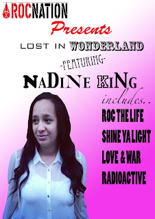
For our group magazine, we tried to interpret the theme of R&B but also a hint of Pop throughout advertising for a promotional tour advert. Both me and Nadine took time looking at our Rita Ora (our artists) posters and also artists that are familar to her and of the same convention; we took inspiration with other posters/advertisements layout, designs and contrasts of colours.
I feel that this poster connects with a demographic of both R&B conventions and Pop as the bold and intimidating font and dark/edgy colours red and black appeal to a stereotypical R&B fanbase, which contrasts to the bubblegum pink background which suggests the artist has a fun and bubbly side to her which helps to intrique both audiences of a R&B and Pop demographic.
The 'Roc Nation' logo helps to lure in any fans of the record labels fanbase as the label is very popular label which manages stars like Jay Z, Kayne West and Rihanna ext. Which sets out huge expectations for this up and coming artist.
I feel this advert is good as it is clear who theartist is and what the advert is telling us to do, and is crucial to appeal to both male and female audiences with the use of pink and black. The font also can showa metaphor for the artist by suggesting that because the fonts are different sizes that she doesnt take herself to seriously and has different sides to her.
The 2nd promotional advert has a more edgy vibe to it, which features reds and blacks which suggests the artist is mysterious and has a bold and intimidating persona, which fans might be interested to find out more about but also a much more controversal font that some audiences may find hard to view. We felt the glow on the artist and 'Wonderland' suggests a more ghostly and interesting effect which makes it stand out against the bold red background. However the use of Italic and swirly writing helps to engage a more feminine and girly audience but also portrays the artists fun side.
The actual advertising of this poster is more specific and helps the audience with what the album looks like and relates the poster back to the album of the digipak which is more simplistic for the demographic.
We felt that this poster was overall more effective as the colours seem to have a consistancy of a colour scheme and the overall look of the poster is proffesional. Also the conventions of the advert can easily be compared to our chosen artist Rita Ora as she like to use dark and powerful colours and have a close up of her face and all the information that is needed is on the advert.
One way I think this poster could be improved would be to have a popular radio station or magazine to rate us or comment about the album, which will also be good for the media for our artist and audiences will be even more intriqued to find out about her.
 We decided the most effective of the 3 magazines was thelast advert to the right, because it not only advertises the artist but also the product which is shown in the bottom left hand side of the composition and by developing our own research into magazine we acknowledged the fact that audiences do not want to be overwhelmed by loads of writing but a basic and straight to the point layout of an R&B convention, which we have tried to follow in this advert, which we felt as a group was eye catching, followed the theme of red,black and white which creates a rough vibe to the artist which helps connect the artist and demographic.
We felt that the poster that Nadine created for the group was successful and really helped capture the look of the R&B vibe we was going for as the text used was hard hitting and we felt looked professional as we see the artist and the product which in the real world really helped promote the artist.


You have made a start in analysing your group magazine adverts and you have considered the image and colours well.
ReplyDeleteTo develop this post you need to explain which advert belong to which group memeber and a further discussion to explain your reasons